
There’s a moment every founder has when they realize their website isn’t doing what they hoped it would. Maybe it loads slowly. Maybe it looks off on a phone. Maybe the text feels cramped, the buttons are too small, or the layout breaks in ways you didn’t expect. Or maybe it’s something more subtle — people visit, but they don’t stay. They don’t click. They don’t convert.
In almost every case, the root cause is the same: the site wasn’t built with a mobile‑first mindset.
Mobile‑first isn’t a trend. It’s not a design preference. It’s not a “nice to have.” It’s the foundation of modern web design — the difference between a website that works and a website that frustrates. Between a brand that feels polished and one that feels outdated. Between a digital presence that supports your business and one that quietly undermines it.
This article breaks down why mobile‑first matters, how it impacts user experience, SEO, conversions, and brand perception, and what it actually means to build a website that’s optimized, responsive, and truly mobile friendly.
The Shift: Why Mobile‑First Became the Standard
To understand why mobile‑first is essential, you have to understand how dramatically user behavior has changed.
More than half of global web traffic now comes from mobile devices. For many industries — food, retail, hospitality, personal services, local businesses — that number is even higher. People browse on their phones while waiting in line, sitting on the couch, or multitasking through their day. They expect websites to load instantly, look clean, and work flawlessly on small screens.
But the shift isn’t just about traffic volume. It’s about intent.
Mobile users are:
-
More decisive
-
More action‑oriented
-
More impatient
-
More likely to bounce if something feels off
They’re not casually browsing. They’re trying to get something done — find information, book a service, buy a product, read a review, or understand what you offer.
If your site doesn’t meet them where they are, they leave. And they don’t come back.
What “Mobile‑First” Actually Means
Mobile‑first isn’t just “make it look good on a phone.” It’s a design philosophy that starts with the smallest screen and scales up, not the other way around.
Traditionally, websites were designed for desktop first. Then designers would try to shrink the layout down for mobile. The result was usually cramped, broken, or visually overwhelming.
Mobile‑first flips the process:
1. Design for the smallest screen first
2. Prioritize essential content
3. Build clean, simple layouts
4. Scale up to tablet and desktop
This approach forces clarity. It forces intention. It forces you to decide what actually matters.
A mobile‑first site is:
-
Faster
-
Cleaner
-
Easier to navigate
-
More accessible
-
More user‑friendly
-
More conversion‑focused
And because it’s built on a strong foundation, it naturally scales into a better desktop experience too.
Why Mobile‑First Matters for User Experience
User experience (UX) is the heart of a good website. And mobile‑first design directly improves UX in ways that desktop‑first design simply can’t.
1. It reduces cognitive load
Small screens force simplicity. You can’t hide behind clutter, long paragraphs, or complex layouts. You have to make choices — and those choices make the experience better for everyone.
2. It improves readability
Mobile‑first typography is larger, cleaner, and more intentional. It’s built for scanning, not squinting.
3. It creates intuitive navigation
Hamburger menus, sticky headers, thumb‑friendly buttons — these aren’t trends. They’re usability essentials.
4. It eliminates friction
When your site loads fast, looks good, and works smoothly, people stay longer and engage more.
5. It builds trust
A polished mobile experience signals professionalism. A broken one signals neglect.
People don’t consciously think, “This site wasn’t built mobile‑first.” They think, “This feels messy,” and they leave.
Why Mobile‑First Matters for SEO
Google has been clear for years: mobile‑friendly sites rank higher. In fact, Google now uses mobile‑first indexing, meaning it evaluates the mobile version of your site before the desktop version.
Mobile‑first impacts SEO in several ways:
1. Faster load times
Mobile‑first sites are lighter and more optimized. Faster sites rank better.
2. Better Core Web Vitals
Google measures things like layout shift, interactivity, and visual stability — all of which improve with mobile‑first design.
3. Lower bounce rates
If your site loads slowly or looks broken on mobile, users bounce. High bounce rates hurt rankings.
4. Better engagement metrics
Time on page, scroll depth, and click‑through rates all improve when the mobile experience is strong.
5. Clearer content hierarchy
Mobile‑first forces you to structure content in a way that search engines understand.
SEO isn’t just keywords. It’s experience. And mobile‑first is the foundation of that experience.
Why Mobile‑First Matters for Conversions
A website isn’t just a digital brochure. It’s a conversion tool — a place where people decide whether to trust you, buy from you, or work with you.
Mobile‑first design directly increases conversions by:
1. Making CTAs more visible
Buttons are larger, clearer, and easier to tap.
2. Reducing friction in forms
Mobile‑first forms are shorter, simpler, and easier to complete.
3. Improving product visibility
Clean layouts highlight what matters most.
4. Supporting faster decision‑making
Mobile users want answers quickly. Mobile‑first design delivers them.
5. Creating a seamless path to action
When the experience feels effortless, people convert without hesitation.
A mobile‑first site doesn’t just look better — it performs better.
The Three Pillars: Optimized, Responsive, Mobile Friendly
These terms get used interchangeably, but they’re not the same. A truly modern website needs all three.
1. Optimized
An optimized site is built for performance:
-
Fast load times
-
Compressed images
-
Clean code
-
Efficient scripts
-
Smart caching
-
Minimal bloat
Optimization is the engine under the hood. It’s what makes the site feel fast, smooth, and reliable.
2. Responsive
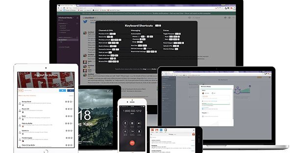
A responsive site adapts to any screen size:
-
Mobile
-
Tablet
-
Laptop
-
Desktop
-
Ultra‑wide monitors
Responsive design uses flexible grids, fluid images, and media queries to ensure the layout always looks intentional.
But here’s the key: Responsive is not the same as mobile‑first.
A site can be responsive and still be poorly designed for mobile. Mobile‑first is the strategy. Responsive is the execution.
3. Mobile Friendly
A mobile‑friendly site is easy to use on a phone:
-
Buttons are large enough
-
Text is readable
-
Navigation is simple
-
Forms are usable
-
Layouts don’t break
-
Content is scannable
Mobile‑friendly is the user experience layer — the part people actually interact with.
What Happens When a Site Isn’t Mobile‑First
When a site is built desktop‑first and shrunk down, several problems show up immediately:
-
Text becomes too small
-
Buttons become too close together
-
Images overflow or crop awkwardly
-
Layouts break
-
Menus become unusable
-
Forms become frustrating
-
Load times increase
-
Content feels overwhelming
-
Users bounce
These issues aren’t minor. They’re conversion killers.
A website can look beautiful on desktop and still fail on mobile — and if it fails on mobile, it fails overall.
The Business Impact of Mobile‑First Design
Mobile‑first isn’t just a design choice. It’s a business decision.
1. Higher engagement
People stay longer when the experience is smooth.
2. Higher conversions
Clear CTAs and frictionless paths lead to more action.
3. Better brand perception
A polished mobile experience signals credibility.
4. Better SEO
Mobile‑first indexing rewards sites that prioritize mobile.
5. Lower maintenance
Mobile‑first sites are cleaner and easier to update.
6. Future‑proofing
New devices, screen sizes, and technologies integrate more easily.
A mobile‑first site is an investment that pays off across every part of your digital ecosystem.
How to Build a Mobile‑First Website (Even If You’re Not a Designer)
You don’t need to be a developer to understand the principles of mobile‑first design. Here’s what to prioritize.
1. Start with content hierarchy
Decide what matters most. Put it first.
2. Use clean, simple layouts
Avoid clutter. Embrace whitespace.
3. Prioritize readability
Use larger fonts, shorter paragraphs, and clear spacing.
4. Make navigation effortless
Sticky headers, simple menus, and clear paths.
5. Optimize images
Compress them. Resize them. Don’t overload the page.
6. Test on real devices
Not just simulators — actual phones.
7. Reduce load time
Every second counts.
8. Use mobile‑friendly forms
Short, simple, and easy to complete.
9. Design for thumbs
Buttons should be large and reachable.
10. Build up, not down
Start small. Scale up.
These principles apply whether you’re using WordPress, Divi, Squarespace, Webflow, or a custom build.
Why Mobile‑First Is a Brand Decision, Not Just a Design Decision
Your website is often the first impression someone has of your brand. And first impressions happen fast — especially on mobile.
A mobile‑first site communicates:
-
Professionalism
-
Modernity
-
Attention to detail
-
Respect for your audience
-
Confidence in your brand
A desktop‑first site communicates the opposite — even if unintentionally.
People don’t separate design from brand. They experience them together. A mobile‑first website tells your audience:
“We care about your experience. We built this for you.”
And that message matters.
The Future Is Mobile‑First — and Beyond
Mobile‑first isn’t going anywhere. If anything, the future is moving toward:
-
Mobile‑only experiences
-
App‑like websites
-
Gesture‑based navigation
-
Voice‑assisted browsing
-
AI‑driven personalization
-
Ultra‑fast, lightweight frameworks
A mobile‑first foundation prepares your site for whatever comes next.
The Real Reason Mobile‑First Matters
At its core, mobile‑first design is about empathy. It’s about understanding how people actually use the internet — on the go, on small screens, with limited time and high expectations.
A mobile‑first website respects your audience. It meets them where they are. It makes their experience easier, faster, and more enjoyable.
And when you make things easier for people, they reward you with their attention, their trust, and their business.